Alas! Atlas! (2012)
Fog and reality! Cloud and mappemonde!
Victor HUGO
KEYWORDS: visualisation, cartography, cartogram, Facebook, US presidential election 2012, Purple America
Recently, I opened my Facebook account to see the juxtaposed images of two maps of the United States. The first map illustrated the results of the 2012 American presidential election: blue states for the Democrats and red states for the Republicans. The second map, dated 1846, was a representation of abolitionist and slave states before the start of the American Civil War.[1]

What struck me at first glance was the apparent similarity between the two maps. It seemed that the distribution of political forces was the same. The abolitionist states and territories of 1846 were, more or less, the Democratic states of 2012. The slave states and territories were clearly in the camp of Republicans. The effectively demonstrated parallels were so compelling that I immediately shared the image. This commentary by Michelle Lawrence was accompanied by two short sentences: “Sometimes change is really hard especially when people don’t want to change. Just something to ponder.” Indeed, looking at the two images gave the impression that nothing has changed in the one hundred and sixty-six years that we have travelled. In short, as the saying goes, ‘the more things change, the more they stay the same.’
The concept of mapmaking inspires respect; there is an air of truth and authenticity about the practice. It is difficult to doubt the reality of map, maybe because of an innate trust we carry for them. In any case, I was there at my computer, confronted with this terrifying image of an unchanging world. And I was disappointed to think that we, as a society, have made such a long journey to be staring back at that very sad starting point. After a few minutes, my enthusiasm to share this with other Facebook users quickly turned into interrogation. What was the reality mapped out before me? Is the world of today really the same as the world yesterday?
To put it all in a historical context and to see if the American electorate had evolved over the years, I began to think of other presidential elections. I thought right away of the Ronald Reagan tidal wave of 1984. The winds of conservatism swept across America leaving only Minnesota and Washington, DC to the Democrats. At the other end of the spectrum, there was the decisive victory of Franklin D. Roosevelt (1936) who was re-elected triumphantly leaving the Republicans with the two small states of Maine and Vermont. On the other hand, and in an almost negative image of the 2012 election, we find the Jimmy Carter election results of 1976. It firmly placed in the Democratic camp all of the southern states often associated with the Republicans.[2]

On this closer examination, I had difficulty in reconciling the three maps above to the political immutability underpinned by the ‘2012 – 1846’ image. Were there changes or not? Looking at a wider scope of images mapping the results of previous presidential elections, it is clear that there have been many changes over the years. The problem with a comment like the one that Michelle Lawrence made, is that it is simplistic and sensationalist. The difficulty of reconciling what is seen and what is said resides in the fact that these particular maps are not speaking about the same thing. The context is warped.
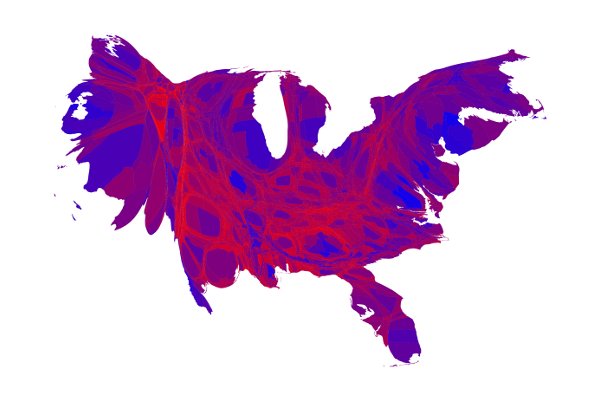
Presenting pictures that look alike offers a simplified view of the past and of the present. It is a truncated, veritably ‘fake’ reality. There has been a lot of talk about polarized American viewpoints and this dual image suddenly offers proof of legendary division. If we are truly interested in evaluating voter diversity in the United States, we should look farther. Perhaps we should begin with the maps of Purple America[3], and migrate to the cartograms of election results complied by Mark Newman of the University of Michigan.[4]

But, the deed was done. I had, in a burst of thoughtless enthusiasm (as is often the case on the Internet), joined the ranks of 45,000 other Facebook users who had also shared the maps and the comment. At first, the juxtaposition of the NOW and THEN image, seemed to offer an eloquent synthesis of the situation, but ultimately it is clear that all who clicked to share were duped. If the shortcut was not a trap, it was certainly a cul-de-sac.
Daniel Dugas
November 12, 2012
Footnotes
[1] Michelle Lawrence, Facebook Account, November 10, 2012
http://www.facebook.com/michelle.lawrence.92754
[2] The website 270 to win offers interactive maps of every presidential election since 1789. To put the maps in context the site also lists the major issues of the day. http://www.270towin.com/ November 10, 2012
[3] Robert J. Vanderbei, Election 2004 Results: http://www.princeton.edu/~rvdb/JAVA/election2004/ November 10, 2012
[4] Mark Newman, Department of Physics and Center for the Study of Complex Systems, Maps of the 2012 US presidential election results : http://www-personal.umich.edu/~mejn/election/2012/
See also: 2012 U.S. Election Visualizations, Christopher G. Healey, Department of Computer Science, North Carolina State University http://www.csc.ncsu.edu/faculty/healey/US_election/
November 10, 2012
Leave a comment
Daniel H. Dugas
Archives
Blogroll
- A.I.R. Vallauris
- ACAD
- Adobe additional services
- Adobe Creative Cloud
- AIRIE
- Amaas
- Amazon Author Central
- ARTothèque
- Australian Poetry
- Basic Bruegel
- Bitly
- CCCA
- CDBaby
- Cycling 74
- Dissolution
- Éditions Prise de parole
- Emmedia
- eyelevelgallery
- FAVA
- Festival acadien de poésie
- Festival FRYE Festival
- FILE – Electronic Language International Festival
- Freeware list
- Fringe Online
- Galerie Sans Nom
- Gotta Minute Film Festival
- Instants Vidéo
- JUiCYHEADS
- Kindle Direct Publishing
- Klondike Institute of Art and Culture
- La Maison de la poésie de Montréal
- La Maison de la Poésie et de la Langue française Wallonie-Bruxelles
- Laboratorio Arte-Alameda
- Le Centre Jacques Cartier
- Liberated Words
- Maison Internationale de la Poésie – Arthur Haulot
- MediaPackBoard
- Miami Book Fair International
- Monoskop
- Mot Dit
- NSCAD University
- Paved Arts
- PoetryFilm
- Portail des auteurs du Nouveau-Brunswick
- RECF
- Revue Ancrages
- Salon du Livre du Grand Sudbury
- Sculpture Space
- Subtropics.org
- Sydney college for the arts
- The Centre for Contemporary Canadian Art
- The New Gallery
- Trevigliopoesia
- tumbler-documents
- V Tape
- Valerie LeBlanc
- VideoBardo
- Void Network-Κενο Δίκτυο
Categories
- #covidpoèmes
- Advertisement
- AIRIE
- Ancrages
- anthology
- Anthropocene
- Architecture
- Around Osprey
- art
- Article de presse
- arts visuels
- audio
- Australian Poetry
- Basic Bruegel Editions
- Book
- book fair
- Cafe Poet Program
- Ce qu'on emporte avec nous
- Citations gratuites
- Collaboration
- commentaire
- commentary
- Compte rendu
- conférence
- Conservation Foundation of the Gulf Coast
- COVID-19
- Critique littéraire
- culture
- Daniel Dugas
- Design
- Édition Michel-Henri
- Éditions Perce-Neige
- Éloizes
- Emmedia
- emoji etc | émoji etc
- Environnement
- essai
- essay
- Everglades
- Exhibition
- festival
- Festival acadien de poésie
- Festival Frye Festival
- FIPTR
- Flow: Big Waters
- Fundy
- Habitat
- installation
- Instants Vidéo
- interactivity
- journal
- JUiCYHEADS
- Kisii
- L'Esprit du temps
- laptop
- Leaving São Paulo
- lecture
- Livre
- logos
- Magazine
- Miami Book Fair
- Moncton 24
- novel
- OASIS
- oil spill
- perception
- performance
- Photo
- poésie
- Poetic Licence Week
- Poetry
- politics
- politique
- press
- Prise de parole
- Revue Ancrages
- salon du livre
- sculpture
- Sculpture Space
- sound
- Souvenirs
- Spirit of the Time
- Style & Artifacts
- Symposium d'art/nature
- talk
- television
- The New Gallery
- Uncategorized
- Valerie LeBlanc
- vidéo
- vidéopoésie
- Videopoetr/Vidéopoésie
- videopoetry
- visual arts
- What We Take With Us
- youth literature


